Friday, April 30, 2010

The Reading List: Guns, Germs, and Steel

Guns, Germs, and Steel
by Jared Diamond

A long time ago, in a Midwestern state far, far away, I regularly taught classes in “World Regional Geography” to small auditoriums full of eager college students. There were several vague themes to these classes, such as “it’s good if you can find India on a map” and “a grown-up should really have a clue about how the weather works” and “people in other countries do things differently, yet not always as differently as you might think.” In addition, I always tried to outline a broad narrative for why it was that folks from a fairly limited number of places on the globe ended up imposing elements of their lifestyle across whole continents, while a vast number of other people have had to give up their ways of doing things, often at the point of a sword.

I’ve never really missed that job – until now. Now, I want to go back and design a course that isn't structured around the appallingly fragmented textbooks I knowingly inflicted on the students back in the day. Instead, I want to design a class around texts like Jared Diamond’s Guns, Germs, and Steel.

I have known about this book since it was published, but I had never felt the need to read a popular account of the same stuff that I spent nine years of my life studying. But that was a mistake, and not just because Diamond doesn’t only tell the story with much, much more style and grace than I ever did. More importantly for my purposes, his interdisciplinary approach brings to the table a lot of details that I hadn’t known about, and at several points clarified some of the leaps of logic that I hadn’t even really realized I was making.

So What’s it All About?

Our history as a species is kind of complicated, and of course there are a lot of zigs and zags in the pattern. What Diamond is able to do is zoom way back to a level where the big, prevailing pattern of history becomes clear. And that pattern goes like this: over time, dense agricultural societies tend to win.

They win for a lot of reasons, perhaps not least that they end up with more people on their side than other kinds of societies. They are able, just like your fifth grade teacher told you, to support “specialists” who do things other than farm, such as make tools, write stuff down, or get everybody else organized whether they want to be organized or not. They are able to save up stocks of food for a bad year or for a marauding army. They are able to retain innovations, which have a way of dying out in smaller or more scattered societies. And crucially, they live in poor sanitary conditions in close proximity to animals, and thus periodically develop diseases that cut terrible swathes through their society. This certainly seems like a disadvantage when it’s happening, but if you know the story of how the West was won, you understand why enduring a little plague from time to time gives your society a grim advantage in the long run.

But That Brings Up Another Question...

So far, so good. But why do some societies become dense and agriculture while others don’t? Why did the good people of the Fertile Crescent and the Chinese plains develop dense agriculture early on while the good people of the highland Americas developed it late and the good people of Australia and so many other places developed it not at all? The answer, it turns out, is pretty much that people developed dense agriculture… wherever they could.

See, where geographers and the like had gone wrong in thinking about this before is by focusing on climate. This had gone so very, very badly – to the tune of “people in temperate climates are quick-witted and vigorous, while people in tropical climates are stupid and lazy” – that there was a reaction against even thinking about the effect of environment on culture for several decades. After all, even when you strip away any implicit racism, thinking about climate's influence on culture leaves holes big enough to march a marauding army through, such as -- to pick one of a thousand possible examples -- why did dense urban civilization develop in the Mediterranean climate of the Mediterranean, but not the Mediterranean climates of California, coastal Chile, or South Africa?

It turns out that the key factor isn’t climate, but the plants and animals that happen to live in your neighborhood. Clever ecologists have looked at native wild grains and other starchy, empire-buildin’ types of plants, compared their relative gross yield of calories and proteins among several other factors, and determined that the ones that ended up getting domesticated were, well, the best ones. In other words, wheat isn’t just one grain out of an infinity of plants out there that people might have domesticated. It was, instead, a virtual time-bomb of potential human utility that all but guaranteed an enormous competitive advantage to the first society that domesticated it on a sustained basis. (If you are wondering why corn didn’t have the same explosive impact in the Americas, the answer is only it didn’t have time to; the ancestor species of the behemoth corn we eat today was teeny tiny, and the grain just hadn’t been bred big enough for long enough to fuel the explosive level of socio-technological development that would have let the Aztecs sail over to Europe and kick some, say, Danish butt.)

There are, similarly, a lot of different kinds of animals in the world, and if you are like me you might assume that it is just a random few that happened to get domesticated. Diamond is able to make a pretty convincing argument – the jury isn’t entirely in on this one, but they are working on it – that no, the animals that got domesticated are the ones that could be domesticated. Bears, tigers, zebras, elephants, rhinos: sure, all might make superb eatin’, or great draft animals, or pass on terrifically deadly diseases for you – but it ain’t gonna happen. For various reasons dealing with hard-wired animal psychology, you simply can’t domesticate them. Happening to live near ancestral cows, sheep, goats and so on was thus a way of drawing a very high card in the game of societal competition. Ending up on a continent like Africa, where the abundant megafauna just happens to be resistant to domestication, or like Australia, where everything but a single kind of kangaroo was wiped out in the excitement of the first arrival of human beings several thousand years ago, is just plain bad luck.

“Now wait,” you might be thinking. “This is raw determinism! Just because a society lives around ancestral wheat and ancestral goats doesn’t mean they will choose to make the big switch from hunting and gathering to sedentary farming.” And indeed not. In fact, you could make a case that the smarter societies would avoid such a thing at all costs, because hunting and gathering in a productive environment was a highly chill sort of lifestyle compared with the brutal drudgery of farming.

But, says Diamond, this is irrelevant. Because eventually, over the many generations, some society will, for some reason – chronic scarcity, the rise of a bossy horticulturalist, or even a series of years where the gathering is so good in one specific meadow that it turns more or less by accident into a field – stumble over into agriculture. And once that happens, it incrementally confers so much power on that society and its new way of doing things that going back becomes very quickly impossible. A decade or two of growth at the rate made possible by farming's food yields, and you've got waaaay too many mouths to feed by hunting and gathering.

Well, That’s History for You

There’s more work to be done on grand-scale history, to be sure. And Diamond even makes a fairly glaring misstep, with a chapter about the relative benefits of having your continent oriented along a longitudinal axis versus a latitudinal axis. What he’s getting at is how ecological barriers can inhibit the flow of ideas, technologies, and those handy epidemic diseases, but couching this as a matter of continental orientation, when you have a sample size of three, is a bit daft. But by and large, I suspect that future work on the large-scale history of humanity will be a progressive refinement of, rather than a serious alternative to, the narrative that Diamond outlines here.

Some people, to be sure, will be bothered or appalled by such an amoral picture of history. We have raised to be in horror of the impositions of colonialism and imperialism, and in the better and fairer world that humanity has more or less been trying to build for the last little while, this is right and just. We recoil from the collective memory how the English wrested New Zealand from the Maori, and we recoil, though perhaps with some confusion, from Diamond’s telling of how the Maori wrested the Chatham Islands from their inhabitants, who they enslaved or slaughtered. We recoil from the heinous story of Cortez and the Aztecs, as we should, and if we dig in a little we will also grieve for the many cultures trampled under the bare but powerful foot of the Aztecs.
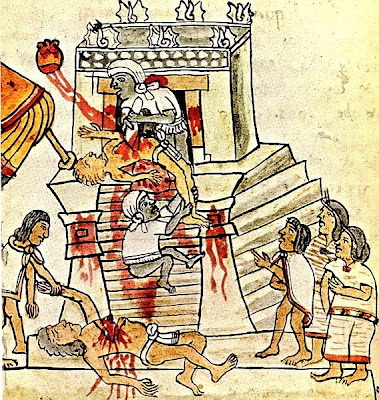
Human history is, alas, a story of bigger fish eating little fish, and in order to tell the story efficiently Diamond makes his sympathy for the little fish clear at the outset but does not repeat it in every paragraph. This lets him get beyond the well-meant but morally suspect story of history we teach our children – the story of how the big fish were wicked and the little fish were virtuous. Wickedness trumps virtue, we tell them, and that’s more or less how things came to be as they are.

Instead, he is able to address with clear vision the question of why some fish got bigger than the others. And in so doing – abandoning my fishy metaphor – he actually makes history more rather than less humane. Diamond offers us a theory of history in which all peoples are created equal, none especially smarter, or wiser, or more virtuous than any other.

Why, then, do some societies come to dominate others? Well, when you boil it down, it’s for the same reason that some people within any society come to dominate others. There is, to be sure, a little bit of what you might call individual or societal character involved. Mostly, though, the winners are the ones that happen to get started in the right place at the right time.

Thursday, April 29, 2010

MapBookFest II: Paris Underground

In which I look at a second of the books covered in Steven Heller's March 7 New York Times review of books about maps.


Paris Underground by Mark Ovenden

In recent years, there has been a tremendous, and arguably kind of strange, surge in interest in transit maps. Mark Ovenden's Paris Underground is subtitled The Maps, Stations, and Design of the Metro, but the stations and design are definitely supporting actors. The maps, past and present, are the real stars of the show.

It definitely falls into the Kitchen Sink school of coffee table books, with lots of images and a minimum of interpretive content.

Really, the imagery is so tightly packed that the book is revealed for what it really is: somebody's else's scrapbook of Paris mass transit miscellanea.

If you happen to share that person's fascination with Parisian subways, this book is going to knock your socks off.

Otherwise, it will be an interesting browse that leaves you a little numb from the sheer density of images. Fewer but bigger pictures would be a little less exhausting.

In several places, Paris Underground shows details from several generations of map treatments of the same area or the same subway line, lined up next to each other. These layouts are my favorite part of the book.


If you are a fan of Paris, maps, and subways, have I got a book for you! If you are a fan of two out of the three, you'll probably think Paris Underground is pretty cool. Otherwise, it might be fun to flip through at your friend's coffee table, but you probably aren't going to put it on yours.

Your Thursday Boring Postcard from Michael5000


100 MILE HOUSE, B.C.

A new shopping centre to serve the people of a fast growing community 100 Mile area is a good place to spend a holiday as there are many lakes, resorts and guest ranches in the area as well as new modern shops for the shopper.

Provenance: Unknown.

Wednesday, April 28, 2010

The Wednesday Quiz II:9 -- Professional Sports Teams


The Wednesday Quiz -- Season II -- Quiz 7

Professional Sports Teams

The Wednesday Quiz is a "closed-book" test of knowledge and intuition; please do not look up answers, ask others for help, or answer as a team.

Questions about the rules and the ~Fabulous Prizes~ are answered here.

---

This week's Quiz is, perhaps, yet another "geography quiz in disguise." Ten points for every correct answer.

What City is Home to These Professional Sports Teams?

Note: Each question has only a single answer -- in other words, the Argonauts, Blue Jays, and Raptors all hail from the same city.
1. Argonauts/Blue Jays/Raptors

2. Arsenal/Chelsea/Saracens/Wasps

3. Blues/Cardinals/Rams

4. Bobcats/Panthers

5. Bruins/Celtics/Patriots/Revolution

6. Braves/Falcons/Hawks/Thrashers

7. Celtic/Rangers/Warriors

8. Flames/Stampeders

9. Orioles/ Ravens

10. Timberwolves/Twins/Vikings/Wild
Submit your answers in the comments!

Tuesday, April 27, 2010

A Voice From the Past

Last week, I showed you some of the little items that Mrs.5000 and I found inside the Castle5000 walls during our tediously ongoing bedroom remodel. I neglected, though, to mention something we found literally ~on~ a wall. More specifically, it was something carved into a door moulding that was revealed only after we sanded off several layers of paint. Seven letters can been clearly seen, etched deep in the wood by a very sharp knife or blade!


Now, it's a little hard to see in the photograph, so I've performed a subtle image enhancement to help you read it better.


Isn't it always so interesting to encounter such messages, little missives sent forwards into our own time from unknown people of the past!? In this case, too, there is the question of what it might mean. Our working theory is that someone named Killfux must have lived in the house before us. Perhaps that was the last name of the charming children we saw in last week's post.

It was difficult to decide whether to preserve this little piece of Castle5000 heritage, but in the end we decided to paint over it along with the rest of the mouldings. We hope you will not think us historically insensitive.

Monday, April 26, 2010

The M5K Decathlon 2010!!


Are You Ready?!

Hey, it's that time of year again! Time for the annual M5K Decathlon!!!

Except...

Except -- as I'm sure you'll be delighted to learn -- we're not going to do that this year. It's too damn much work for both of us.

You're welcome.

Note that this also means that Blog Dork Eversaved gets to be the M5K Decathlon champion in perpetuity. w00t!

Sunday, April 25, 2010

Your Sunday Boring Postcard from Michael5000


OREGON MYRTLE TREES

Trees of rare beauty, thick and satiny leaves, olive like fruit and fragrant oil. Many reach a height of 60 to 80 feet. Only found on the OREGON COAST and in Palestine.

Provenance: Sent (hand delivery) by Niece #1, 2010.

Saturday, April 24, 2010

Art In the Mail

So BigSister5000 -- not to be confused with occasional commenter sister jen, I've got a couple of 'em -- did this thing on the Facebooks where she made sixteen pieces of index-card sized art, numbered them in a random sequence, and sent them out, in order and no strings attached, to the first sixteen people who said "me me me"

I was #2.


The found text reads one who, like a great general, inspires not love or devotion, but absolute trust and loyalty and smaller, so that you don't notice it at first, one additional word: lucky.

My two thoughts on receiving my card were:
i: my sister is awfully cool, and

ii: my favorite thing about the internet is the platform it allows for collective play and creativity. You and me both, if we look at it one way, have thrown a lot of our time into the glowing screens of these machines. But, an awful lot of opportunities for enrichment and for human contact (stop smirking, Dr. Noisewater) are available today that just weren't fifteen years ago. A life woven through with the internet is, at the very worse, a mixed curse.
But you know that, or you wouldn't be here.

Friday, April 23, 2010

The Flag Friday Index

The Flag Friday project has become interesting enough -- by which, of course, I mean interesting enough to ME -- that I figure it needs a better index and a place to summarize the collected ideas, opinions, and what-not that it has generated. This will be the new "home page" for the project.


The Flag Friday project is an ongoing critique of the Flags of the world. It was inspired by New Zealand philosopher Josh Parsons' reviews of the world’s flags from some years back, possibly the only comprehensive critique of the world’s flags on record. Each flag review cites Parson's assessment before explaining why I agree or disagree with him; then you, the reader, have a chance to agree or disagree with me.

As I mention every post: These discussions are about graphic design, and perhaps about nationalism and national symbolism in general. They should not be taken as critical of the countries, ideals, cultures, or people that the flags represent.

Contents
I: Grades
II: Glossary
III: The Flag Index
IV: Other Flag Posts of Yore
V: Flaggy Links from the L&TM5K Readers

I: Grades

For ease of comparison, I use Parson’s system of letter grades, which runs basically like so:

A = Excellent; Inspired
B = High Quality Flag with only minor concerns
C = Satisfactory Flag
D = Problematic Flag
F = National Embarassment

II: Glossary

The Betsy Ross Principle: At anything but the broadest level of abstraction, pictures are too detailed to be immediately recognizable at any distance and thus run counter to good flag design. Too, one feels that a flag ought to be something that could be put together by the local
Betsy Ross figure out of, literally, whole cloth. A fussy image that requires custom-printed fabric is vaguely undemocratic, and sacrifices the clean, bold aesthetic of solid blocks of color.

Civil Flags: The ordinary flag of a country, as opposed to the fancy State Flags that are often used to mark especially important national locations or people. Flag Fridays focuses on Civil Flags.

The Kid With Crayons Tests: The Kid With Crayons Test was originally suggested by Aviatrix and subsequently refined by points raised by The Unwise Owl.

  • The Kid With Crayons Simplicity Test is, like The Betty Ross Principle, a measure of a flag's relative simplicity. It suggests that an ideal flag should have a simple enough design that a child can reproduce it accurately with crayons.
  • The Experiential Kid With Crayons Test is a necessarily subjective assessment of a flag's immediate visual impact. It implies that certain flags -- eg. that of Bhutan -- have a design that might inspire a child to want to draw it in crayon, regardless of the design's complexity.
Maps on Flags: Parsons considers the presence of a map on a flag a grave cartographic error. I see no problem with cartographic flags in principle, but will also concede that maps are often a dodgy design element in practice.

State Flags: Special versions of a countries flag used to mark special occasions or locations. See "Civil Flags."

Tricolors: Flags that are comprised of three fields or "stripes" of color, running either horizontally or diagonally. Parsons posits "do not use a tricolour unless you are in Europe" as a rule of flag design, but I disagree wholeheartedly with him on this point. Tricolors are the very epitome of classic flag design, simple, bold, and immediately identifiable. European countries use them for the reason that they have strong use value, and triumphed over all other possible national signifiers through a historical process of evolution. To tell the younger countries of the world that they can’t use this design because it’s already been done is essentially to tell them that their flags shouldn’t look like flags.

Words and Names on Flags. Both Parsons and I am generally hostile to the idea of names on flags. The whole purpose of a flag is to present a graphic representation for a political entity, and if you have to (to take an example from the gallery of horrors that is the U.S. State flags) actually write “Oregon” on your banner, you have clearly committed a vexology fail.


III: The Flag Index

Afghanistan, Albania, Algeria, Andorra, Angola, Antigua & Barbuda

Argentina, Armenia, Australia, Austria, Azerbaijan, Bahamas

Bahrain, Bangladesh, Barbados, Belarus, Belgium, Belize

Benin, Bhutan, Bolivia

Bosnia, Botswana, Brazil


Brunei, Bulgaria, Burkina Faso, Burma, Burundi


IV: Other Flag Posts of Yore

The L&TM5K Awards for Flag Merit

Thoughts on the Flag(s) of Angola

Flag Colors of the World

Thoughts on U.S. State Flags

The Wednesday Quiz II:1

Canadian and Australian Flags Quiz

The Monday Quiz IL


V: Flaggy Links from the L&TM5K Readers

What is Written on the National Flags (Cartophiliac)

The intersection of Flag and Food (Elizabeth)

Thursday, April 22, 2010

The Library Book Sale CD Trove XV


The Spring Sale has come and gone, and here I am still reviewing my CD finds from half-price day at last fall's Friends of the Multnomah County Library Annual Booksale.

Nostalgie
Edith Piaf

I don't know a lot about French popular song, but I usually like it when I hear it. I know next to nothing about Edith Piaf, but I certainly recognize her as a Big Name in the Chansons tradition. So, I expected that this collection of nostalgic old numbers would evoke cozy afternoons in a shabby but cosmopolitan Paris cafe, or something. I thought I'd dig it.

What I actually got was music that I think it is fair to describe as "grating." The recordings are apparently quite old; one way or the other they are about as tinny as you can get this side of a wax cylinder. During the early years of recorded music, musicians would often work around the technology with arrangements that played to the technology's strengths and avoided its weaknesses, but no such effort seems to have been made in this case. In most of the numbers, it sounds like most of the musicians are playing in the next room over.

I'm not sure if I'm getting an accurate representation of Piaf herself, but there's a slightly grinding quality to her voice here that rubs me the wrong way. The songs themselves have a monotony to them, and you can tell without knowing a word of French (I don't) that they are the usual tired recitations about the excitement of romantic love, the melancholy brought on my loss of love, the pain of love gone bad, and perhaps a saucy romp or two on the subject of hilariously sexual love.

Prognosis: Yours for the asking.


Beethoven: Piano Sonatas 5, 10, 19, & 20
Emil Gilels, Piano

Hey, it's Beethoven! Played by a great pianist! On a great classical label, Deutsche Grammophon (German for "German Gramophone"). Of course it's awesome! But as I've said before, solo piano music is more chillout music for me than it is music I can sit down and listen to intently. But whatevs!

Prognosis: It's a keeper. It's currently part of a small library I'm keeping at work and listening to with an old-school "Discman."

Wednesday, April 21, 2010

The Wednesday Quiz II:8 -- Pantheons


The Wednesday Quiz -- Season II -- Quiz 7

Pantheons

The Wednesday Quiz is a "closed-book" test of knowledge and intuition; please do not look up answers, ask others for help, or answer as a team.

Questions about the rules and the ~Fabulous Prizes~ are answered here.

---

This week's Quiz is yet another is-it-or-isn't-it game. It has twelve items, and the scoring is ten points for every correct answer after your first two.

For each religious or mythological tradition shown,

Is It or Isn't It matched with major deities from its pantheon?

Note: There is no mixing and matching here; answers are either entirely correct or entirely incorrect.
1. Aztec: Huitzilopochtli, Tezcatlipoca, Quetzalcoatl

2. Greek: Demeter, Hephaestus, Hermes

3. Greek: Lemnos, Samos, Naxos

4. Hindu: Assam, Manipur, Tamil Nadu

5. Hindu: Manipur, Maharashtra, Tripura

6. Incan: Sulawesi, Luzon, Mindanao

7. Islamic: Salat, Zakāt, Sawm

8. Norse: Odin, Loki, Frea

9. Norse: Offa, Æthelwulf, Æthelbald

10. Roman: Ares, Aphrodite, Hermes

11. Roman: Juno, Minerva, Diana

12. Zoroastrianism: The primary deity, Ahura Mazda, and a nemesis spirit of evil, Angra Mainyu

Submit your answers in the comments!

Tuesday, April 20, 2010

The Great Movies: "Dr. Strangelove"

At the Movies with Michael5000


Dr. Strangelove
Stanley Kubrick, 1964


Previous Contact: I watched Dr. Strangelove the first time in a college auditorium, which is probably the best setting for it. I thought it was completely engrossing and hilarious. I believe the current watching is the third time I’ve seen it.

- - - - -

Dr. Strangelove is a quirky, upbeat comedy about cold war paranoia and nuclear annihilation. It was filmed with what was obviously a minimal budget – there are perhaps five locations in the entire movie, and a model airplane flying over a surreally vague landscape – but it looks terrific throughout. Scenes alternate between suspenseful action on the airplane and comic scenes, mostly close shots of exaggeratedly expressive faces, at the air base and at the Pentagon. The suspense is suspenseful and the comedy is funny. Many, many directors have thrown exponentially more money at movies that didn’t have half the visual and visceral impact.

The political satire is extremely broad, with a cast of characters that includes a grave and insane Ruskie-hatin’ Air Force general, an affably stupid Ruskie-hatin’ Air Force general, the drunk Soviet premier (who is offstage, but vividly present at the other end of a telephone), and the title character, a sinister wheelchair-bound Machiavellian with an eternal grin, a thick German accent, and a right arm that jerks periodically into uncontrollable fascist salutes. And that’s just the highbrow humor.

The middlebrow humor includes (along with the ridiculously long subtitle, which we do not have space for here) obvious set-ups like a man in a phone booth trying to convince an operator to connect him to the President of the United States in order to avert global annihilation, only to find that he’s twenty cents short. Or, say, an administrative assistant translating the gruff, macho utterances of a General with whom she’s obviously just been rolling in the hay into exaggeratedly polite, professional secretary-speak. The lowbrow humor includes silly names (General Jack Ripper, Premier Kissoff, Colonel Batguano) and, in the movie’s weakest moment, a man getting sprayed in the face with cola from a vending machine that he has just shot. It is said that the original script called for a big pie fight at the end; this was filmed but, happily, edited out.

So basically, it sounds terrible. And indeed, there are a lot of people who kind of hate Dr. Strangelove. But I’m not one of them. There are very few movies out there that manage to combine the better virtues of the action thriller and the screwball comedy. Hell, off the top of my head, I can only think of one: Dr. Strangelove. And for some reason, it works beautifully. Between Stanley Kubrick’s rare genius, inspired ensemble casting (George C. Scott as the irrepressible boy-man Commander of the Air Force; cowboy character actor Slim Pickens as a B-52 Commander; and Peter Sellers, for some reason, in three principal roles), a strong comic script, and a certain exuberant ridiculousness – seriously, “Colonel Batguano”? – this weird creation has a legitimate claim to be on a list of the all time great films.

Plot: Concern over fluoridation leads an Air Force General to launch a massive nuclear strike on the Soviet Union. The consternation this causes the civilian leadership only intensifies when it is discovered that the Soviets have just completed work on a Doomsday Device that will, in response to this attack, end all life on Earth! Hijinx ensue.

Visuals: No two ways about it, this was not a high-budget movie. But its visual impact per dollar spent on sets and effects – a tricky metric, I realize – must be among the highest ever.

Dialog: Wacky and satirical and often pretty goofy. On the attack airplane, however, the dialog is often crisp and technical, a reasonable guess at what a plane full of horrified but thoroughly trained men knowing that they were part of a large-scale atomic attack might have acted like.

Prognosis: Recommended for fans of Stanley Kubrick or Peter Sellers, of course. Also highly recommended for those amused by the lighter side of nuclear war, anyone who is wondering how a movie could be a screwball action thriller comedy, and anyone who always thought that Ronald Reagan was kind of a nutjob.

Monday, April 19, 2010

Ghosts in the Walls


Work continues in fits and starts on the Castle5000 bedroom remodel, and recently we tore out some crappy built-in bookshelves to replace them with, hopefully, better built-in bookshelves.


Whenever you open up the walls in an old house, you have good odds of finding little items that, although commonplace enough, are rendered mysterious by where you've happened to find them.


Houses often change their shapes over the course of their lives. Amateur home archeologists that Mrs.5000 and I are, we were intrigued to find three layers of wallpaper, one painted over, on a surface that hasn't been exposed for decades.


This game piece for Reversi, or perhaps Othello, must have fallen through a crack sometime in the last 40 years. Who lost it? When? Did it ruin their day, or did they not even notice it was missing?


A playing card, folded in quarters. It's the three of diamonds, which seems like an inauspiciously weak card to draw from behind the walls.


A broken part of a cheap, militaristic toy airplane. "Made in Hong Kong," as was so much toy trash of the 1960s and 1970s.


And then, along with an old battery, broken paint brushes, two pennies, a safety pin, and other minor items: a strip of negatives. Remember negatives? They were a kind of intermediary between film cameras and the prints that you would pick up from the store, back when you would sometimes see your pictures weeks or even months after you pushed the button. This has, quietly, been one of the more profound changes to everyday life during my adulthood, so it was fun to take the negatives across the street to the drugstore, just like in the old days.


What came back are pictures of children engaged in wholesome-looking educational activities.

We can determine, to our disappointment, that none of the photos were taken in Castle5000. Did the children live here, though? Or were they dear to someone who did?


These kids might be anywhere from 25 to 50 today, although 35 to 45 seems like a reasonable guess based on the vintage their surroundings. There is no date on the film, and no clues to their connection to the house. They could be anyone, in a sense, and they could be anywhere.

If you happen to BE one of these children, please check in. We're curious.

Sunday, April 18, 2010

I Iz Crappy Poet!


You never know what might come back to haunt you: Vice Dork Jenners airs my poetic dirty linen.


Update: and frequent L&TM5K commenter Jennifer gets in on the act. Sheesh.

Friday, April 16, 2010

Contesting Bulwer-Lytton


The Last Days of Pompeii
Edward Bulwer-Lytton
1834


For some reason I got it into my head that I should read something by Edward Bulwer-Lytton. If the name sounds familiar to you, this is almost certainly due to the Bulwer-Lytton Contest, a longstanding competition in which people vie to compose the worst possible opening line to an imaginary novel. He is the namesake of the contest due to his reputation for wooden prose -- a reputation that the popularity of the contest has done much to amplify and broadcast. But then, this is the man who began a novel (Paul Clifford) with "It was a dark and stormy night," a line now mostly famous for being mocked by a cartoon dog some 130 years later.

Yet back in the day Bulwer-Lytton was an bestselling author with a wide and enthusiastic following. He wrote well over twenty novels as well as a few volumes of verse. His books were widely translated into other European languages, and a number of them were made into operas. Nor was his fame especially fleeting; no less than six movie adaptations were made of The Last Days of Pompeii up to 1959. The 1946 edition of Last Days that I have just finished reading is from a series called "Great Illustrated Classics," which includes it among many books we still instinctively think of as "Great Classics" -- Great Expectations, Huckleberry Finn, Emma, Walden, the Odyssey -- along with others whose reputations, with Bulwer-Lytton's have paled somewhat over the last six decades: Ben Hur, say, or Ivanhoe, or something called The Talisman. It is worth mentioning, too, that as far as I can tell The Last Days of Pompeii has not been out of print since it was first published in 1834, and that a visitor to Amazon as of this writing could choose among more than thirty editions.

So it's an interesting question: who was right? The Victorians, who thought Bulwer-Lytton a ripping good read, and the editors of the early Twentieth Century who thought he was a great, important literary figure from their past? Or We Moderns, who think he's a something of a joke? Is it possible that for whatever reason -- simply to make room for more recent books, say, or perhaps to make room for more books by women, or more non-European writers, or just because of some colossal lapse of the collective critical judgement -- we have let one of the geniuses of our cultural heritage slip into obscurity? I wanted to find out.

The Last Days of Pompeii

Well, it's not much of a contest. Virtually any modern reader is going to find Bulwer-Lytton's prose style lodged somewhere between "wooden" and "laughable," perhaps painfully so. And to prove this point, I will now use a random number generator to pick out four sentences from the book. Whatever four sentences come up will do nicely to prove the point.
1. No! the conquest of the cestus was not sufficient -- he had not yet won the prize of victory -- his father was still a slave!

2. Something, I say, there was in this scene which peculiarly affected Apaecides; and, in truth, it is difficult to conceive a ceremony more appropriate to the religion of benevolence, more appealing to the household and everyday affections, striking a more sensitive chord in the human breast.

3. "Talk not of him," said Ione, covering her face with her hands, as if to shut out his very thought.

4. On the lower seats round the arena sat the more high-born and wealthy visitors -- the magistrates and those of senatorial or equestrian dignity; the passages which, by corridors at the right and left, gave access to these seats, at either end of the oval arena, were also the entrances for the combatants.

So, yeah, this is not what most of us call stellar prose writing. The chopped-up sentences, the breathless exclamation marks! -- and a certain pomposity of tone aren't the half of it. Bulwer-Lytton is constantly jumping into the frame, as in sentence 2, to comment on the action as if he was sending us a postcard. He scoffs at subtlety, making absolutely sure we understand, for instance, why Ione has covered her face with her hands (indeed, sentence 3 manages to tell more or less us the same thing about what's on Ione's mind three seperate times in a single short sentence). And, as sentence 4 illustrates, Bulwer-Lytton is very excited by all he has learned about Roman history. He wants to share his excitement with us, even -- as here -- when it matters not a whit to anything happening in his story. And I'm being a little kind to sentence 4 in this regard, having left off its explanatory footnote about where the equestrians sat relative to the senators.

Well, what about the plot? After a slow start in which very little seems to be happening, it turns into a reasonable enough sort of potboiler. Glaucus is in love with Ione, but her guardian Arbaces has the hots for her too, so when it comes out that the rich young Julia is jealous of Ione, Arbaces agrees to set her up with a love potion she can use on Glaucus. Except, he treacherously gives her a poison instead, but then the blind slave who is ALSO secretly in love with Glaucus steals the potion, and so on and so forth, and eventually there is a murder and gladitorial combat and the whole works. All of this plays out against sub-plots involving the penetration of early Christianity into Roman society, and Bulwer-Lytton's ideas about the relative merits of Roman, Greek, Egyptian, and modern European civilizations.


So Is It a Lost Classic?

No. It's not. You can safely add this one to your personal list of books that Michael5000 read so you wouldn't have to. It's interesting as a historical artifact, but you're really not going to find much enrichment here. Especially during the slow-moving first half, the prose style renders Last Days so tedious that to read it is an act of sheer willpower carried out chapter by slow chapter.

Having said that, by the end of the novel I found myself having become fond of The Last Days of Pompeii's unintentional protagonist: Edward Bulwer-Lytton. He is such a smart, decent-seeming guy, and so very, very earnest! He wrote the book after visiting what was then the very recently excavated ruins of Pompeii, and he is clearly so excited to share his new knowledge and theories about life in that ancient town that he can hardly contain himself. His plotting is not particularly sophisticated, but you can tell he had an awfully good time working it all out. His material on the early Christians is every bit as pious as you would expect from a Victorian Englishman, but he uses it very generously to make a pointed critique of religious and cultural intolerance in his own time.

It's idle speculation, but I found myself wondering from time to time how much, if at all, Bulwer-Lytton edited his work. The Last Days of Pompeii feels, to me anyway, like the first draft of a decent Victorian novel, one that was written out straight from the first sentence to the last with no attempt ever made to go back and clean up the language. This is utterly improbable, but it does suggest an interesting assignment that could be used in a creative writing class: edit a chapter or more of Last Days to render it good. All the material for a fun romp of a book is there, after all. It's just waiting for someone to carve it out of the stylistic wood.

Thursday, April 15, 2010

Happy Tax Day

It’s Tax Day here in the United States of America, the home sovereign political entity of the Life and Times of Michael5000. This is of course occasion for much traditional bitching and moaning and wry jokes told with the weariness of the long-suffering. That’s fine, of course – nobody likes it when bills come due. But I have to say that all of the negativity bothers me a little bit, too. Tax Day is actually the day of the year when I feel most patriotic, most connected to my country. Independence Day? It's fine, but the Fourth of July is mostly just people having picnics and enjoying fireworks, a traditional form of intentional air pollution. Tax Day, though -- Tax Day is serious. It's about putting your money where your democratic idealism is.

Now, it goes without saying that there is nearly infinite room for disagreement about how much of their wealth individuals and entities should be expected to contribute to the common good. There is also nearly infinite room for disagreement about how public funds should then be spent. The eternal debate over these two topics is in fact the very essence of national life, and when conducted intelligently, rationally, and with a decent respect for the priorities of others, it is something to celebrate.

There is also an element in our society, however, that views virtually any taxation as an evil. More disturbingly, they see it as an arbitrary exaction of that which is theirs by a malicious outside entity, The Government. Now, it is certainly their prerogative to ignore certain fundamental aspects of how a civilization works. They are free to see as somehow sinister the idea of everybody pitching in to a common fund to buy things collectively that it doesn’t make sense to buy individually -- things like roads, fire departments, hydroelectric dams, a diplomatic corps, and, if you collectively happen to want one, a nuclear arsenal.

Where it becomes offensive, though, is when people who are blanket, knee-jerk anti-tax radicals also wrap themselves in a mantle of virtuous, flag-lovin’ patriotism. Because the first duty of a patriot – the very essence of loving your country – is being willing to pony up for your share of the bill. This is true even if you don’t agree in every particular with how the legislatures you and your paisanos have elected have decided how to spend the money. After all, no one does. It is also true even if you don’t agree with every detail of the formula that determines what your share of the bill is. Again, no one does. That's the whole point of a democratic system -- no one gets their way all the time. If you really can’t deal with the fact that some public funds will be used for priorities that are not your own, you really don’t belong in a complex society.

Happy Tax Day! You are a citizen, my friend, and you enjoy incalculably vast personal benefits from being a member of an organized state. Take out your checkbook, allow yourself a wistful sigh, and pay your taxes with pride. Arguments about ways, means, and priorities can resume tomorrow.

To all the rest of you UnitedStatesians out there – hey, we live in a great country! Congratulations to you that you have the privilege of paying your share. And for the rest of you guys – Happy Tax Day to you too, when your turn comes around.


graph via Sociological Images.

Wednesday, April 14, 2010

The Wednesday Quiz II:7 -- Famous Paintings!


The Wednesday Quiz -- Season II -- Quiz 7

Famous Paintings

The Wednesday Quiz is a "closed-book" test of knowledge and intuition; please do not look up answers, ask others for help, or answer as a team.

Questions about the rules and the ~Fabulous Prizes~ are answered here.

---

This week's Quiz is a visual is-it-or-isn't-it game, and an excuse to have pretty paintings on the blog. For each image,

Is It or Isn't It the Painting Described?

There are 14 images this week, because as often happens I got a little carried away. We'll do it again that they are worth ten points apiece after your first four.

1. Chardin, "The Young Schoolmistress." France, 1736ish.


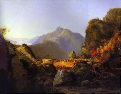
2. Thomas Cole, "Last of the Mohicans." U.S., 1827.


3. Salvador Dali, "Giraffe With Two or Three Men." Spanish, 1924.


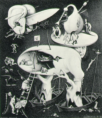
4. MC Escher, "Hell (copy after a scene by Hieronymous Bosch)." Netherlands, 1935.


5. Giotto, "The Marriage at Cana." Italian, 1320s.


6. Francisco de Goya, "The Colossus." Spanish, 1809ish.


7. Winslow Homer, "Breezing Up." U.S., 1876.


8. Wassily Kandinsky, "Composition VII." Russian, 1917.


9. Piet Mondrian, "Composition in Black, Red, Yellow, Blue, and White." French, 1900.


10. Claude Monet, "The Square at Giverny." French, 1798.


11. Pablo Picasso, "The Animals." Spanish, 1953.


12. Johannes Vermeer, "The Milkmaid." Dutch, 1658ish.


13. John William Waterhouse, "The Lady of Shalott." English, 1888.


14. Andrew Wyeth, "Christina's World." U.S., 1948.


Submit your answers in the comments!